Kristen Willett
Branding · Website · Digital Design
Location: Europe & Australia
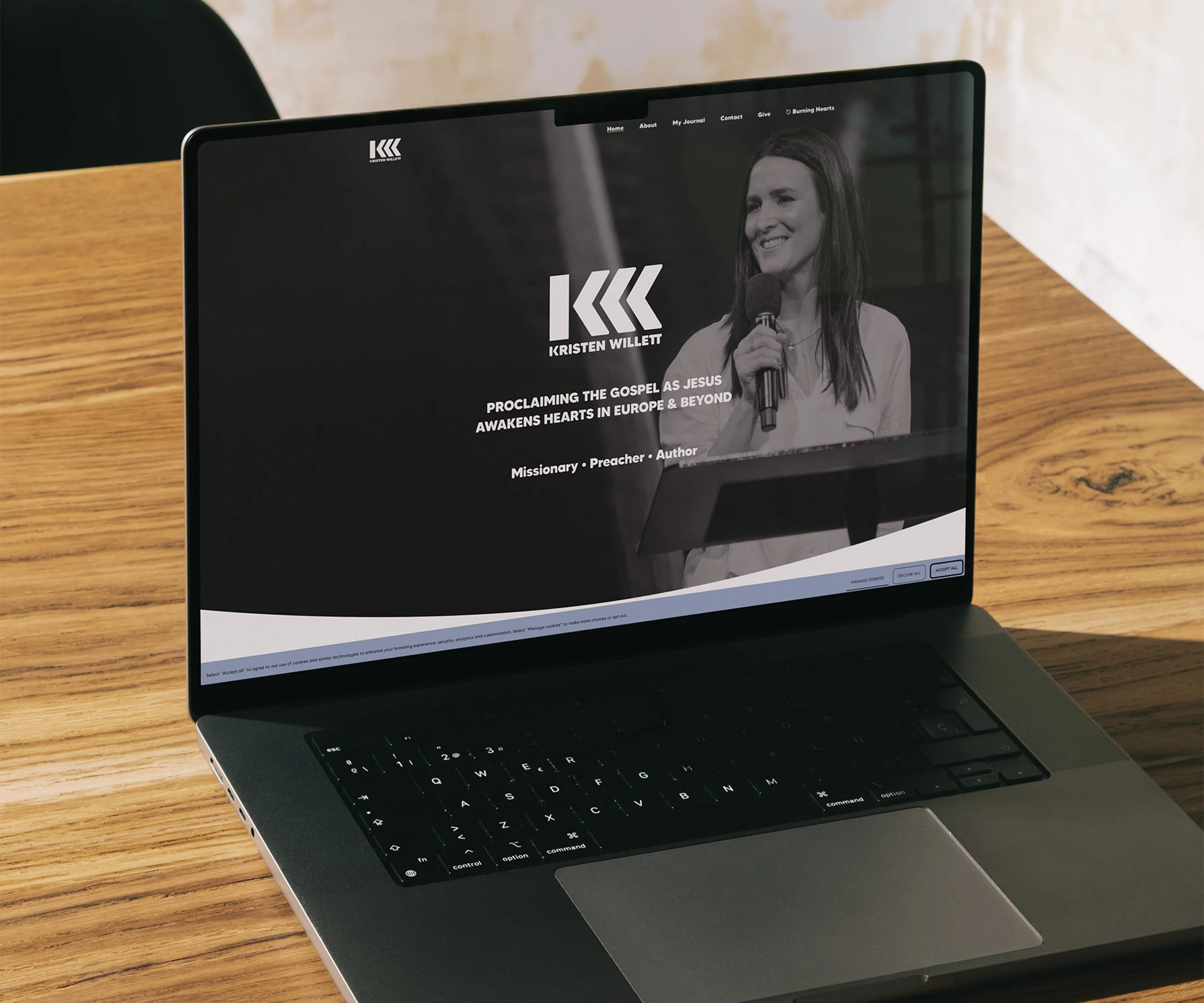
For Kristen Willett, a missionary, speaker and pastor based between Australia and Europe, I was honoured to build a brand that speaks to both identity and calling.
The visual identity centres on a custom emblem where meaning is woven into every detail. At first glance, the shapes form a strong yet simple symbol, but if you look closer you'll see the initials K and W begin to take shape. It carries the feel of a crest or insignia, reflecting a life marked by purpose and mission. The curves are softened to speak of grace, while the structure holds fast, grounded in strength.
Even the name carries weight. Kristen means “Christ follower.” Willett, from the root William, means “strong-willed warrior.” This brand needed to hold both the gentleness of faith and the grit of obedience. The logo also looks like an icon of wheat, pointing to the harvest and the work that comes before it.
The brand colours, a peaceful blue and a golden wheat tone, were chosen to reflect Heaven and earth, peace and promise.
From the branding to the website, digital collateral and photography, every element was created to reflect Kristen’s heart.