Kingdom Come
Sermon Series
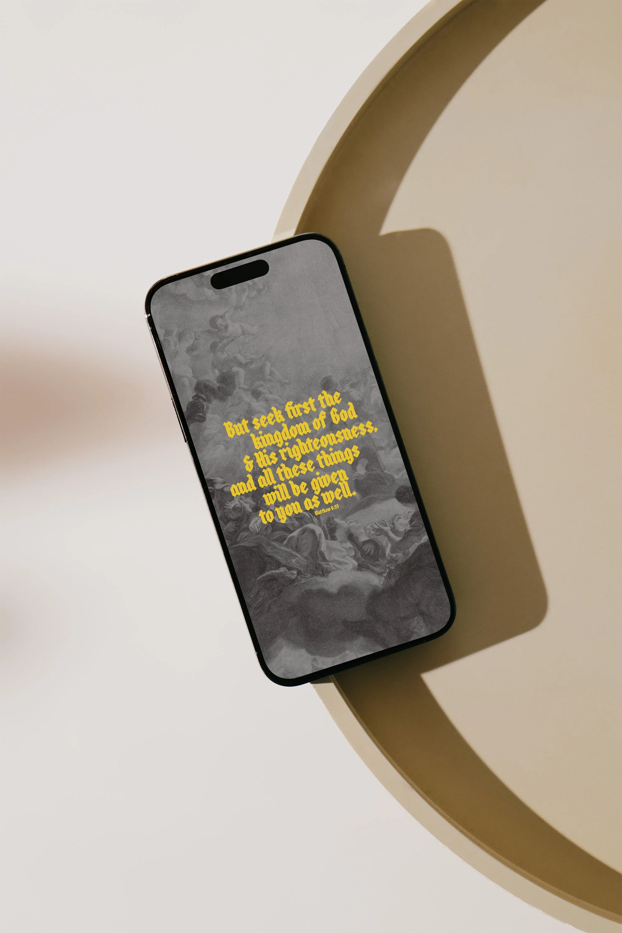
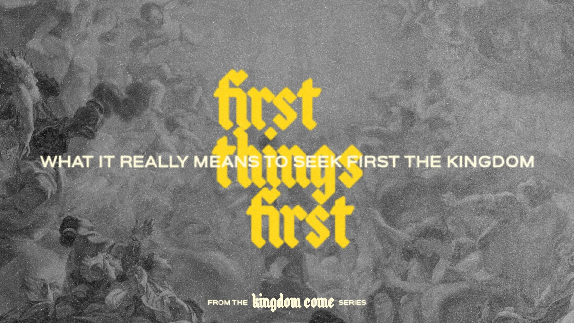
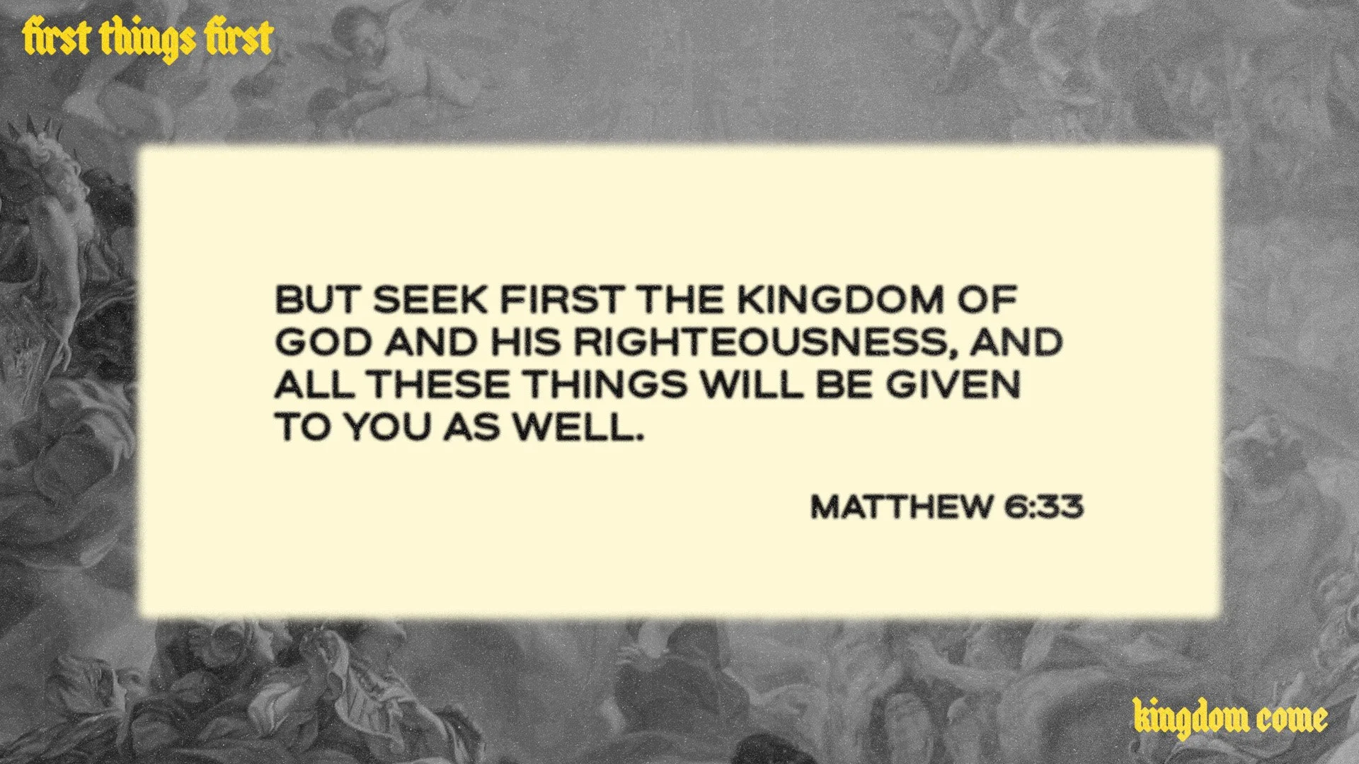
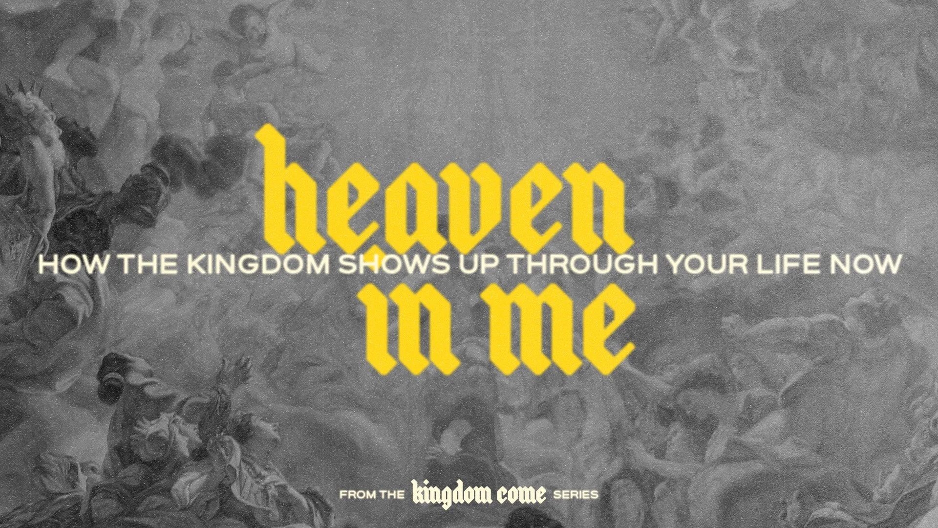
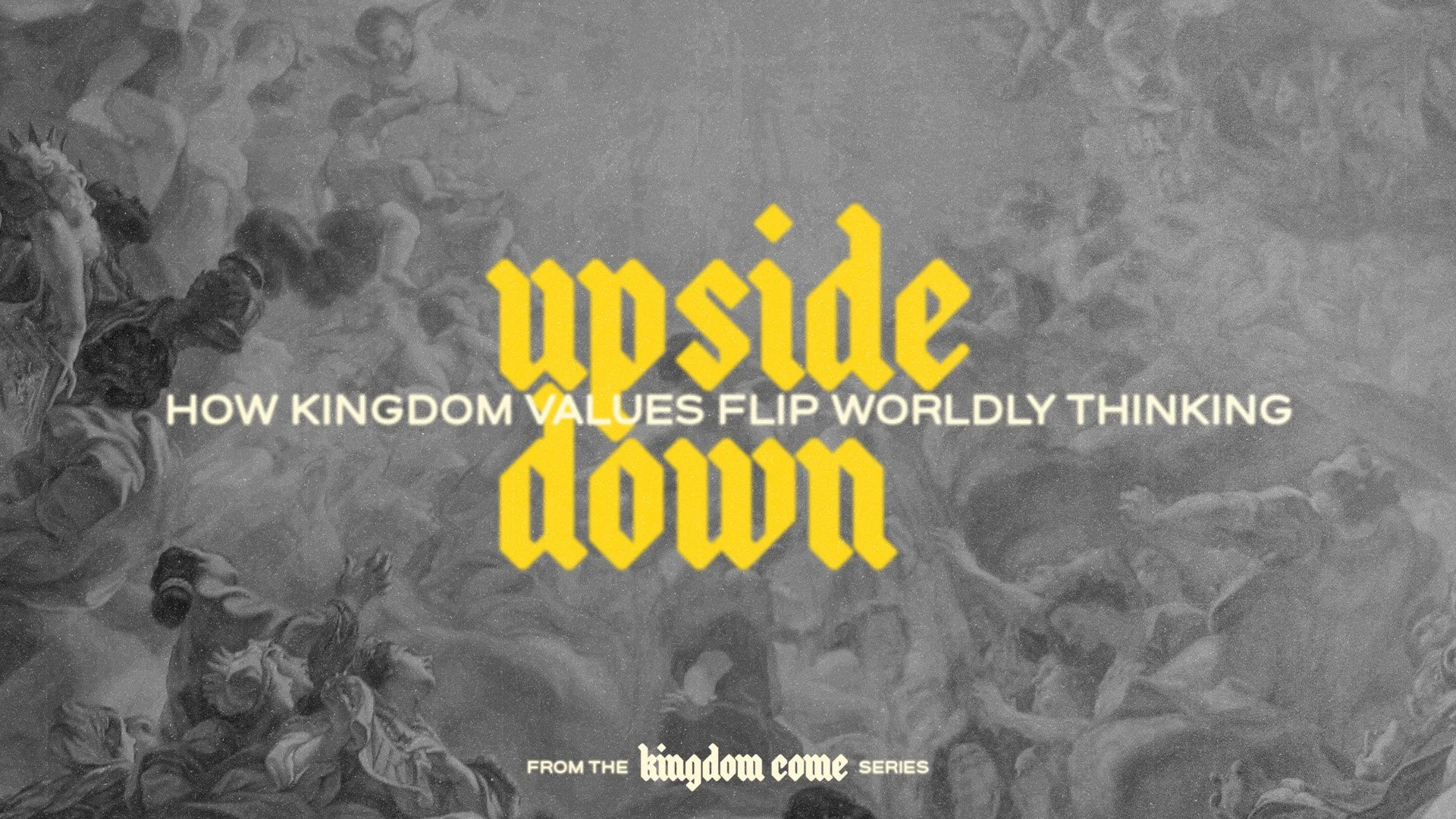
This sermon series was crafted to visually echo the bold call of Matthew 6:33, to seek first the Kingdom of God. With “Kingdom Come,” the design leads with a striking sense of reverence and urgency, appealing especially to a millennial and Gen Z audience hungry for real, grounded faith.
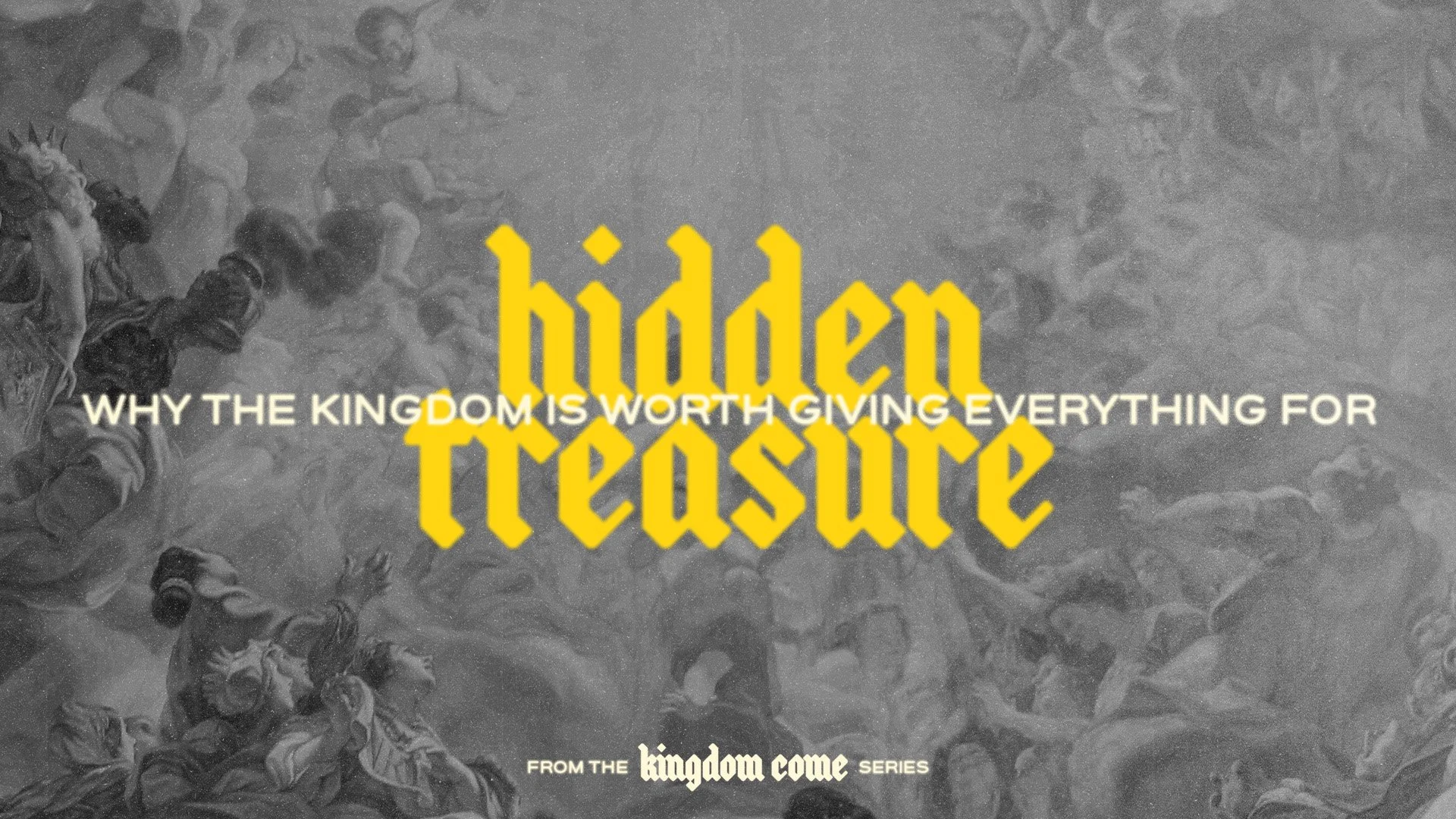
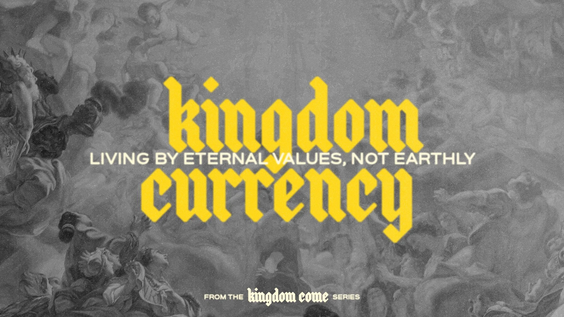
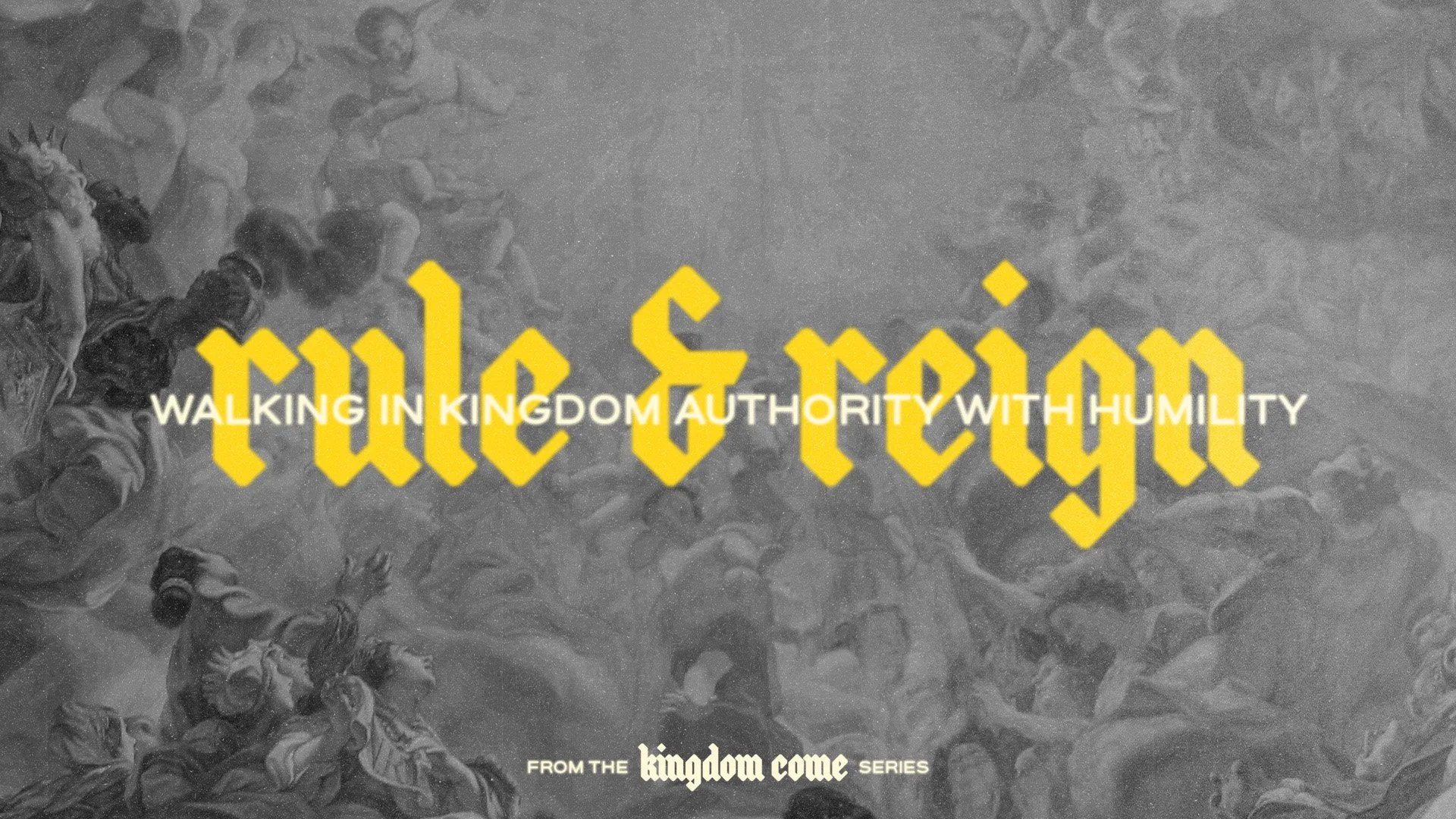
The central visual features classic imagery of people looking upward, a deliberate choice that reflects the longing in every heart to see heaven not just as a future promise, but a present reality. The posture of looking up symbolises expectation and surrender, essentially a cry for God’s rule and reign to shape our everyday lives.
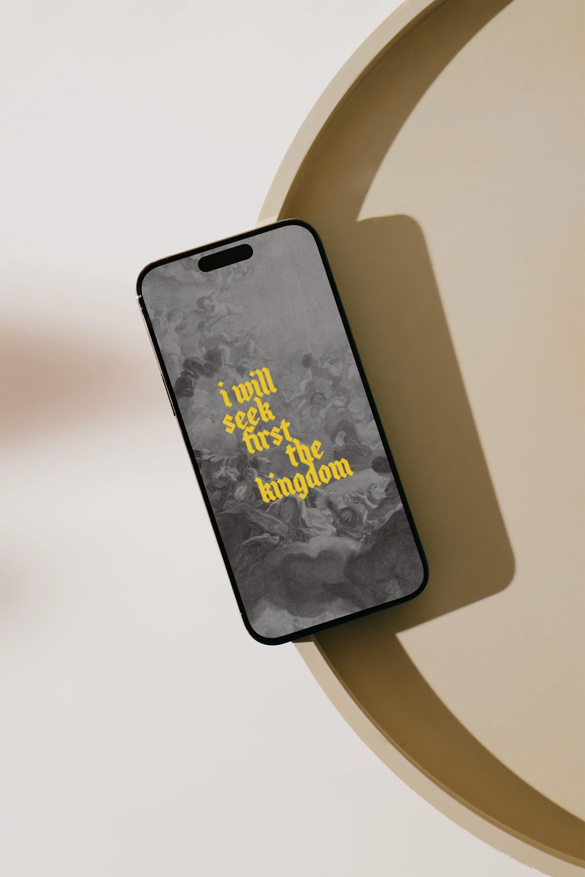
The typeface, a modern interpretation of Gothic blackletter, was selected to evoke royal authority and timelessness pointing to the eternal nature of the Kingdom (and also because it’s cool). The golden yellow reflects the radiance of heaven and the treasure of seeking what truly matters.
This project not only communicates spiritual truth but captures the intersection of reverence and relevance, exactly where the Kingdom is found.